Last week we spoke all about how colours are important in effecting your mood and this week I would like to talk about how imperative it is to make sure you do select the right colours. By sharing my top two tips on working with colour, you will be able to make the right selection.
It is funny to note, that even if a colour has a particular positive effect on you, applied in the wrong way and it can have the opposite effect. I’d love to share with you a story of one of my projects. Currently I am working on a renovation and the wall colour is a really nice pale blue, however in situ it just does not work. This is where my client has not made the right choice with their original colour.
Firstly, the colour does not match anything else in the home and the home does not get a lot of natural light, making it very dark as it is. This causes the space to not feel calm and light but really dull, drag and rather depressing. The colour clashes rather than contrasts with a cream based beige for the doors and skirtings. All the light globes in the home are a bright white and makes the colour feel harsh rather than calming. It also makes the walls look dirty, which is definitely not the desired effect for any home.
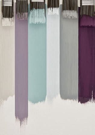
 This is why my top tip for selecting your major paint colours is to keep it very basic and neutral. Feature walls and feature colours are a fantastic way to add accents and this is where I believe you can be a little bolder. If you home gets a lot of natural light then this also can be a great way to introduce a deeper shade or brighter accent colour on your walls. That way the colour will always have a positive effect on you rather than having the opposite.
My other top tip is to use colours in your accessories, that way if you get bored of something then it is easily changed. It also means you can change and adopt colours/patterns to suit your mood and the seasons.